Question: A post office branch recorded the number
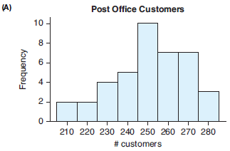
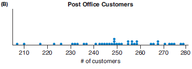
A post office branch recorded the number of customers served per day for a period of time. The data are displayed in the following histogram and dotplot. Based on these graphs, would it be unusual for this branch to serve 250 customers in a day? Why or why not? (Source: Minitab Data Library)
> The following histogram shows the sodium level for 132 people (from the National Health and Nutrition Examination Survey [NHANES]). The units are milliequivalents per liter. Without calculating, give the approximate mean of this distribution.
> The following graph shows the heights for a large group of adults. Describe the distribution, and explain what might cause this shape. (Source: www.amstat.org)
> College students Diane Glover and Esmeralda Olguin asked 25 men and 25 women how many speeding tickets they had received in the last three years. Men: 14 men said they had 0 tickets, 9 said they had 1 ticket, 1 had 2 tickets, and 1 had 5 tickets. Women:
> The data that follow are final exam grades for two sections of statistics students at a community college. One class met twice a week relatively late in the day; the other class met four times a week at 11 a.m. Both classes had the same instructor and co
> The following table shows the gas tax (in cents per gallon) in each of the western U.S. states. (Source: 2017 World Almanac and Book of Facts) a. Find and interpret the median gas tax using a sentence in context. b. Find and interpret the interquartile r
> The following table shows the gas tax (in cents per gallon) in each of the southern U.S. states. (Source: 2017 World Almanac and Book of Facts) a. Find and interpret the median gas tax using a sentence in context. b. Find and interpret the interquartile
> Give an example of another categorical variable we might have recorded for the students whose data are in Table 1A?
> Data were collected on cereals stocked by a supermarket. A portion of the data table is shown below. Data includes shelf location (top, middle, bottom), name, manufacturer, type (hot or cold), and amount of calories, sodium and fiber per serving. Write o
> Data was collected on the tallest buildings in the United States. A portion of the data table is shown below. Write one or two investigative questions that could be answered using these data.
> The graphs below show the weights of professional basketball players. One graph displays the weights of Centers (C) and the other graph displays the weights of Shooting Guards (SG). Write one or two investigative questions that could be answered by analy
> The following graph shows the time it took grade 11 and 12 student athletes to run the 100-meter race (in seconds) in a recent year. Write one or two investigative questions that could be answered by analyzing these graphs.
> Here are the ages of some students in a statistics class: 17, 19, 35, 18, 18, 20, 27, 25, 41, 21, 19, 19, 45, and 19. The teacher’s age is 66 and should be included as one of the ages when you do the calculations. The figure shows a his
> The following histogram shows the average ticket prices of 28 Broadway shows in the 2017 season. The median ticket price was $97.33. (Source: BroadwayWorld.com) a. Describe the shape of the distribution. b. Would the mean of the data be greater than, les
> Mrs. Diaz has two children: a 3-yearold boy 43 inches tall and a 10-year-old girl 57 inches tall. Three year old boys have a mean height of 38 inches and a standard deviation of 2 inches, and 10-year-old girls have a mean height of 54.5 inches and a stan
> Quantitative SAT scores have a mean of 500 and a standard deviation of 100, while ACT scores have a mean of 21 and a standard deviation of 5. Assuming both types of scores have distributions that are unimodal and symmetric, which is more unusual: a quant
> Three-year-old boys in the United States have a mean height of 38 inches and a standard deviation of 2 inches. How tall is a three-year-old boy with a z-score of -1.0? (Source: www.kidsgrowth.com)
> An exam score has a mean of 80 and a standard deviation of 4. a. Find and interpret in context an exam score that corresponds with a z-score of 2. b. What exam score corresponds with a z-score of -1.5?
> Give an example of another numerical variable we might have recorded for the students whose data are in Table 1A?
> The following histograms show ticket prices for professional baseball (MLB) and professional basketball (NBA) tickets. a. Based on the shape of the distributions, which measure of center should be used to compare the prices: the mean or the median? b. Wr
> The following histograms show ticket prices for professional hockey (NHL) and professional football (NFL) tickets. a. Based on the shape of the distributions, which measure of center should be used to compare the prices: the mean or the median? b. Write
> The tables below show the 2015 unemployment rates for states in the northeastern and Midwestern regions of the United States. Compare the unemployment rates for the two regions, commenting on the typical unemployment rate of each region and then comparin
> The tables below show the percentage of the population in western and southern states of the U.S. with a bachelor’s degree. Write a short report comparing the education attainment of these two regions. In your report, answer the questio
> The mean of set A is smaller than that of set B, but the median of set B is smaller than that of set A. Report the mean and the median of both sets of data.
> The means are different, but the standard deviations are the same. Report the standard deviation and both means.
> The means are the same, but the standard deviation of one of the sets is larger than that of the other. Report the mean and both standard deviations.
> The means are the same, but the standard deviation of one of the sets is smaller than that of the other. Report the mean and both standard deviations.
> The histogram shows hours of sleep on a school night for a sample of 12th-grade students. a. Use the histogram and left-hand side of each bin to estimate the mean hours (to the nearest tenth) of sleep for 12th-graders on a school night. b. When comparing
> The New York Times collected data on the number of calories in meals at Chipotle restaurant. The distribution of calories was symmetric and unimodal and a graph of the distribution is shown below. a. Use the graph to estimate the mean number of calories
> Are the following variables, from Table 1A, numerical or categorical? Explain. a. Ring size b. Hair color c. Height
> A StatCrunch survey asked at what age should a person consider retirement. The data can be found at this text’s website. Who thinks people should retire at a younger age, males or females? Support your answer with appropriate graphs and summary statistic
> A StatCrunch survey asked people how many hours of video they watched daily. The data can be found at this text’s website. Who watches more hours of video, males or females? Support your answer with appropriate graphs and summary statistics. (Source: Sta
> The following histogram of marathon times includes data for men and women and also for both an Olympic marathon and an amateur marathon. Greater values indicate slower runners. (Sources: www.forestcityroadraces.com and www.runnersworld. com) a. Describe
> A student has gathered data on self-perceived body image, where 1 represents “underweight,” 2 represents “about right,” and 3 represents “overweight.â€&#
> The accompanying graph shows the distribution of data on whether houses in a large neighborhood have a garage. (A 1 indicates the house has a garage, and a 0 indicates it does not have a garage.) Is this a bar graph or a histogram? How could the graph be
> Refer to the accompanying bar chart, which shows the time spent on a typical day talking on the cell phone for some men and women. Each person was asked to choose the one of four intervals that best fit the amount of time he or she spent on the phone (fo
> The accompanying graph is a special histogram with additional information; it was made using StatCrunch. People who studied music as children were asked how many hours a day they practiced when they were teenagers, and whether they still play now that th
> The following graph shows the ages of females (labeled 1) and males (labeled 0) who are majoring in psychology in a four-year college. a. Is this a histogram or a bar graph? How do you know? b. What type(s) of graph(s) would be more appropriate?
> The pie chart reports the number of hours of sleep “last night” for 118 college students. What would be a better type of graph for displaying these data? Explain why this pie chart is hard to interpret.
> One of the authors wanted to determine the effect of changing answers on multiple-choice tests. She studied the tests given by another professor, who had told his students before their exams that if they had doubts about an answer they had written, they
> A sample of students were questioned to determine how much they would be willing to pay to see a movie in a theater that served dinner at the seats. The male students responded (in dollars): 10, 15, 15, 25, and 12. The female students responded: 8, 30, 1
> The following table gives the number of commercial U.S. radio stations for the four most popular formats. Sketch or otherwise create an appropriate graph of the distribution and comment on its important features. (Source: 2017 World Almanac and Book of F
> The following table gives the percent of the market controlled by the most popular Internet browsers in 2016. Sketch or otherwise create an appropriate graph of the distribution and comment on its important features. (Source: 2017 World Almanac and Book
> Data on the percentage of adults living in the United States who meet the federal aerobic fitness (AF) and muscle-strengthening (MS) standards are displayed in the bar plot. (Source: 2017 World Almanac and Book of Facts) a. Comment on the fitness similar
> Data on obesity rates for adults in the United States are displayed in the bar plot for three age groups. (Source: 2017 World Almanac and Book of Facts) a. Which age group typically has the highest rate of obesity? b. Comment on any similarities and diff
> The Bureau of Labor Statistics tracks data on the percentage of jobs that require various levels of education. The 2016 Entry Level Education data are displayed in the following bar chart and pie chart. a. Approximately what percentage of jobs require so
> Pew Research conducted a survey in 2017 asking gun owners what percentage of time they had a loaded gun easily within reach when at home. The results for male gun owners are displayed in a bar chart and a pie chart. a. Which period was the most frequent
> Applicants to California community colleges are asked to indicate one of these education goals at the time of application: transfer to a four-year institution, an AA degree, a CTE certificate, job retraining, or personal enrichment. In a group of 500 app
> Suppose a group of school-aged children is asked, “Which of these three ice cream flavors do you like the most: vanilla, chocolate, or strawberry?” Describe a bar graph of their responses that would have the least amount of variability. Also describe a b
> According to the World Health Organization (WHO), there are five leading causes of preventable deaths in the world. They are shown in the following graph. a. Estimate how many preventable deaths result from high blood pressure. b. Estimate how many preve
> Emmanuel, a student at a Los Angeles high school, kept track of the calorie content of all the snacks he ate for one week. He also took note of whether the snack was mostly “sweet” or “salty.” The sweet snacks: 90, 310, 500, 500, 600, 90 The salty snacks
> The resting pulse rates (in beats per minute) of a sample of 91 undergraduate students were recorded. The data are displayed in the following histogram and dotplots. Based on these graphs, would you consider a resting pulse rate of 90 beats per minutes t
> The histogram shown is for number of calories in a sample of fast-food items. (Source: Stat Crunch survey). a. What is the bin width of the histogram? b. Would this graph be best described as unimodal or bimodal? c. Approximately what percentage of the f
> The histogram shown is for pulse rates for125 people. Convert the vertical axis to relative frequency and show the value that would replace each of the values on the vertical axis. (Source: NHANES)
> A dotplot of the glucose readings from 132 people (from NHANES) is shown. Some doctors recommend that glucose readings not be above 120 mg/dl. a. How many of these people have glucose readings above 120 mg/dl? b. What percentage of these people have gluc
> The dot plot shown is for resting pulse rates of 125 people (according to NHANES, National Health and Nutrition Examination Survey). Many sources say the resting pulse should not be more than 100. a. How many of the 125 people had resting pulse rates of
> Data are available on the percent alcohol in 101 different beers. Make a histogram of the data, pose a statistical question, and describe that distribution. (Source: beer100.com, accessed via StatCrunch. Owner: Webster West)
> Data are available on the number of calories in 12 ounces of beer for 101 different beers. Make a histogram to show the distribution of the numbers of calories, pose a statistical question, and describe the distribution. The first few entries are shown i
> Recently, 115 users of StatCrunch were asked how many text messages they sent in one day. Make a histogram to display the distribution of the numbers of text messages sent, pose a statistical question, and describe the distribution. Some sample data are
> Data are shown for the cost of one year of law school at 30 of the top law schools in the United States in 2013. The numbers are in thousands of dollars. Make a histogram of the costs, pose a statistical question, and describe the distribution. If there
> A StatCrunch survey asked people whether they preferred cats or dogs and how many pets they had. (Those who preferred both cats and dogs and those who preferred another type of pet are not included in these data.) Make two dotplots showing the distributi
> The idea of sending delinquents to “Scared Straight” programs has appeared recently in several media programs (such as Dr. Phil) and on a program called Beyond Scared Straight. So it seems appropriate to look at a rand
> A StatCrunch survey asked people what they thought the maximum income tax rate should be in the United States. Make separate dotplots of the responses from Republicans and Democrats. If possible, put one above the other, using the same horizontal axis. T
> The accompanying table also shows the gestation period (in days) for some animals. The gestation period is the length of pregnancy. Graph the gestation period and describe the distribution. If there are any outliers, identify the animal(s) and give the g
> The following table in Exercise 2.30 shows the average life span for some mammals in years, according to infoplease.com. Graph these average life spans and describe the distribution. What is a typical life span? Identify the three outliers and report the
> The following table shows a random sample of 50 quantitative SAT scores of first-year students admitted at a university. Make an appropriate graph of the distribution of the data, pose a statistical question, and describe the distribution.
> The table shows prices of 50 college textbooks in a community college bookstore, rounded to the nearest dollar. Make an appropriate graph of the distribution of the data, pose a statistical question, and describe the distribution.
> The data show monthly rents for studio and one-bedroom apartments in San Francisco. Write a statistical question appropriate for these data and a brief comparison of the distribution of rents for these two types of housing units. Include appropriate grap
> The weights of Olympic hockey players and soccer players from recent Olympic Games (in pounds) are shown in the following two tables. Make appropriate graphs and use your graphs to write a brief comparison of the distributions of the playersâ€
> Match each description with the correct histogram. 1. Quantitative SAT scores for 1000 students who have been accepted for admission to a private university. 2. Weights of over 500 adults, about half of whom are men and half of whom are women. 3. Ages of
> Match each description with the correct histogram. 1. Heights of students in a large UCLA statistics class that contains about equal numbers of men and women. 2. Numbers of hours of sleep the previous night in the same large statistics class. 3. Numbers
> Match each histogram given with the following descriptions of data. 1. Number of cups of coffee consumed by one person during a day. 2. Maximum speed driven in a car by college students who drive. 3. Number of times last week that a college student had b
> A study carried out by Baturin and colleagues looked at the effects of light on female mice. Fifty mice were randomly assigned to a regimen of 12 hours of light and 12 hours of dark (LD), while another 50 mice were assigned to 24 hours of light (LL). Res
> Match each of the three histograms to the correct situation. 1. Assessed value of a representative collection of houses in a city 2. Number of bedrooms in the houses 3. Height of house (in stories) for houses in a region that allows up to three stories b
> The histograms show the miles per gallon (mpg) for two makes of cars: Acura and BMW. Compare the distributions. Which make has a higher mpg? Which make has more variation in mpg? (Source: Edmonds.com)
> The histograms show the monthly costs for operating two makes of cars: Ford and BMW. Which make typically has higher monthly costs? Which make has more variation in costs? (Source: Edmonds.com)
> The histogram shows the distribution of the numbers of siblings (brothers and sisters) for 2000 adults surveyed in the 2012 General Social Survey. a. Describe the shape of the distribution. b. What is the typical number of siblings, approximately? c. Abo
> In 2012, the General Social Survey (GSS), a national survey conducted nearly every year, reported the number of years of formal education for 2018 people. The following histogram shows the distribution of data. a. Describe and interpret the distribution
> The histograms show triglyceride levels for 87 men and 99 women. Triglycerides are a form of fat found in blood. a. Compare the distributions of triglyceride levels for men and women. (Be sure to compare the shapes, the centers, and the spreads.) b. Trig
> The histograms show the Body Mass Index for 90 females and 89 males according to NHANES. Compare the distributions of BMIs for women and men. Be sure to compare the shapes, the centers, and the amount of variation for the two groups.
> From the histogram shown in Exercise 2.4, what is the typical number of calories for a fast food item in this sample?
> From the histogram in Exercise 2.3, approximately what is the typical pulse rate in this sample?
> The distribution of in-state annual tuition for all colleges and universities in the United States is bimodal. What is one possible reason for this bimodality?
> Babies 6 to 23 months of age with inner ear infections were given antibiotics. The children were randomly assigned to receive antibiotics for a full 10 days or to receive antibiotics for 5 days and then a placebo for 5 days. There were 229 children assig
> Researchers wanted to assess whether a theory-based, community health worker–delivered intervention for household smokers will lead to reduced secondhand smoke exposure to children in Chinese families. Smoking parents or caregivers who
> Determine the initial direction of the deflection of charged particles as they enter the magnetic fields, as shown in Figure P19.4. Figure P19.4:
> (a) Find the direction of the force on a proton (a positively charged particle) moving through the magnetic fields in Figure P19.2, as shown. (b) Repeat part (a), assuming the moving particle is an electron. Figure P19.2:
> Find the direction of the magnetic field acting on the positively charged particle moving in the various situations shown in Figure P19.3 if the direction of the magnetic force acting on it is as indicated. Figure P19.3:
> Electrons in Earth’s upper atmosphere have typical speeds near 6.00 x 10⁵ m/s. (a) Calculate the magnitude of Earth’s magnetic field if an electron’s velocity is perpendicular to the magnetic field and its circular path has a radius of 7.00 x 10⁻² m. (b)
> A mass spectrometer is used to examine the isotopes of uranium. Ions in the beam emerge from the velocity selector at a speed of 3.00 x 10⁵ m/s and enter a uniform magnetic field of 0.600 T directed perpendicularly to the velocity of the ions. What is th
> Figure P19.14a is a diagram of a device called a velocity selector, in which particles of a specific velocity pass through undeflected while those with greater or lesser velocities are deflected either upwards or downwards. An electric field is directed
> A proton travels with a speed of 5.02 x 10⁶ m/s at an angle of 60° with the direction of a magnetic field of magnitude 0.180 T in the positive x - direction. What are (a) The magnitude of the magnetic force on the proton and (b) The proton’s acceleration
> Sodium ions (Na+) move at 0.851 m/s through a bloodstream in the arm of a person standing near a large magnet. The magnetic field has a strength of 0.254 T and makes an angle of 51.0° with the motion of the sodium ions. The arm contains 100 cm3 of blood
> An oxygen ion (O+) moves in the xy - plane with a speed of 2.50 x 10³ m/s. If a constant magnetic field is directed along the z - axis with a magnitude of 2.00 x 10⁻⁵ T, find (a) The magnitude of the magnetic force acting on the ion and (b) The magnitude
> A proton moves perpendicular to a uniform magnetic field B( at a speed of 1.00 x 10⁷ m/s and undergoes an acceleration of 2.00 x 10¹³ m/s2 in the positive x - direction when its velocity is in the positive z - direction. Determine the magnitude and direc
> Two long, parallel conductors separated by 10.0 cm carry currents in the same direction. The first wire carries a current I1 = 5.00 A, and the second carries I2 = 8.00 A. (a) What is the magnitude of the magnetic field created by I1 at the location of I2
> A 1.00 - kg ball having net charge Q = 5.00 μC is thrown out of a window horizontally at a speed v = 20.0 m/s. The window is at a height h = 20.0 m above the ground. A uniform horizontal magnetic field of magnitude B = 0.0100 T is perpendicular to the pl
> A straight wire of mass 10.0 g and length 5.0 cm is suspended from two identical springs that, in turn, form a closed circuit (Fig. P19.74). The springs stretch a distance of 0.50 cm under the weight of the wire. The circuit has a total resistance of 12
> Which way would a compass point if you were at Earth’s north magnetic pole?
> Protons having a kinetic energy of 5.00 MeV are moving in the positive x - direction and enter a magnetic field of 0.0500 T in the z - direction, out of the plane of the page, and extending from x = 0 to x = 1.00 m as in Figure P19.73. (a) Calculate the
> Two long, parallel wires, each with a mass per unit length of 0.040 kg/m, are supported in a horizontal plane by 6.0 - cm - long strings, as shown in Figure P19.72. Each wire carries the same current I, causing the wires to repel each other so that the a

